It is always a huge struggle for marketers, researchers to show data without being boring. Traditionally, people rely on Excel, PowerPoint to make bar charts, pie charts, etc. Advanced developers utilize python to animate bar charts to make information more engaging and spread-worthy.
If you are seeking an easier way than office suite or python, then incorporating data visualizations into videos is a smart move. You will not need any editing or design skills. Follow the steps below.
Table of Contents


Can't Miss: How to Create an Infographic Video >
FlexClip - Shortcut to an Excellent Data Visualization Video
FlexClip transforms raw data into engaging visual content without any hassle. It offers users 16 chart styles, including bar chart, radial chart, pie chart, line chart. They will meet your needs to display all sorts of data.
Chart customization options are extremely straightforward. You can able to insert data manually, or import data from Excel, and change the color theme. More importantly, all chart examples have animation effects. You don’t have to put much effort into animating them.
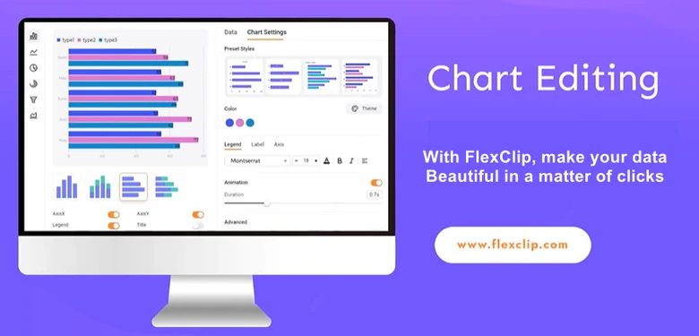
FlexClip - Data Visualizer Tool Overview
Other Key Features of FlexClip as a Data Visualizer
How to Create a Data Visualization Video with FlexClip
Now, let’s see how do we use FlexClip to create a data visualization video. Video tutorial comes first, and what's coming next are text descriptions.
Data Visualization Video Creation - Video Tutorial
Step 1. Organize Your Data
Gather relevant and reliable data that supports the theme of your video. Focus on the key insights and organize them in a structured way with Excel, Google Sheets, etc.
Step 2. Access FlexClip & Setup Background
Access FlexClip’s editing page through the following Create a Data Visualization Video button.

You will be greeted with a 3-second black background. You can change the background color above the preview window, or drag and drop an image to the timeline.
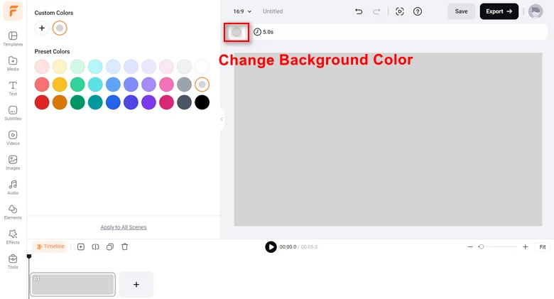
Add Video Background
Instead, FlexClip offers many customizable video templates perfect to display your data. Select one that aligns with your video theme and use it for your project.
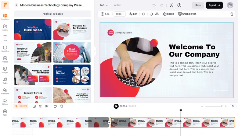
Use FlexClip Template
Step 3. Make Your Information Beautiful
Next up, dive in to the Elements > Chart.
Depending on the data, decide which chart fits your needs most. FlexClip offers bar charts, line charts, pie charts, radial charts, funnel charts, and area charts. You can always find what you need.
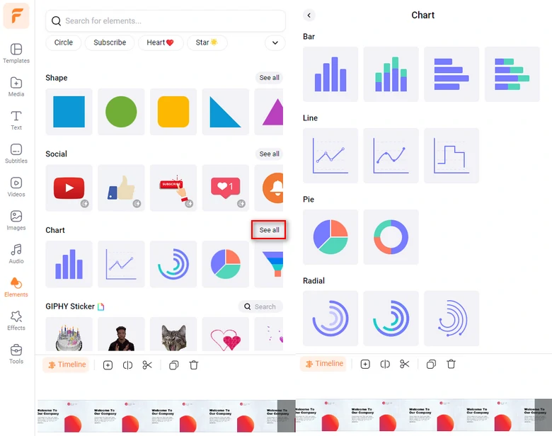
Check All Chart Examples
You are now at the chart editing page. Manually input titles, labels, and data. You can also click on Import Data to use data from a brand new excel. Once your data is entered, you are able to see the finished chart.
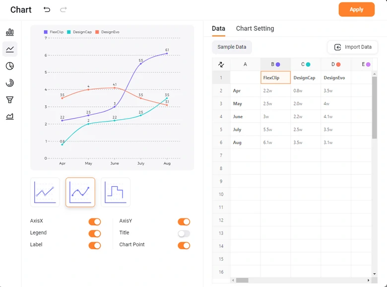
Convert Data to Chart
Step 4. Polish Your Chart
Go to Chart Setting. You can switch between all color schemes, text fonts, sizes. You can also adjust the animation. Make any edits you like to make the chart look better than ever.
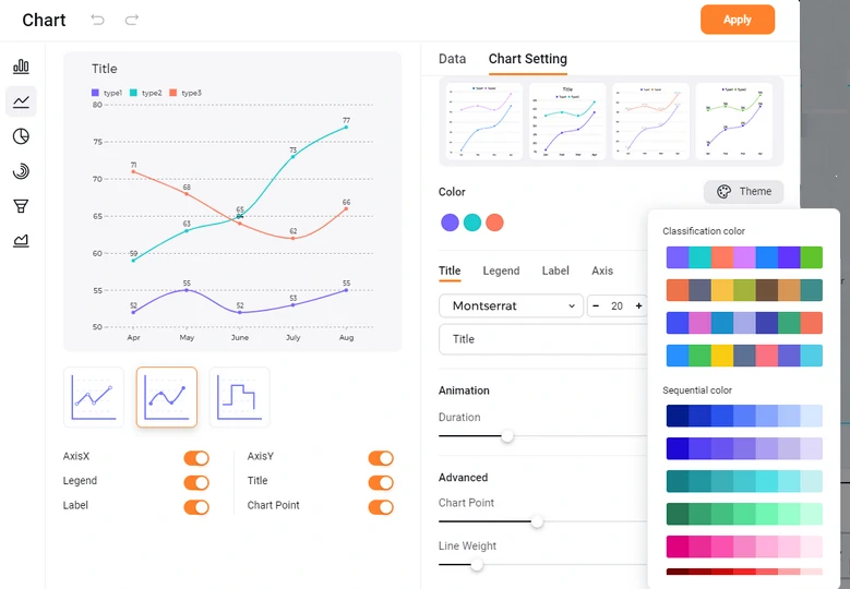
Edit Your Chart
A great voiceover helps audiences understand the statistics better. Use AI to save you from the trouble of recording. Head over to Tools > AI Text to Speech. Select the language, set up the voice, tone, speed, pitch, enter any descriptive sentences about the chart, hit Generate. You will get the best AI narration ever for your data visualization video.
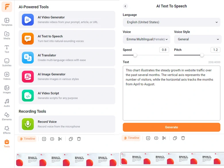
Add AI Voiceover
Step 5. Export & Share
Click on the Export button. There you have tons of options to share your data visualization video. You can export to a local folder, save to cloud service, share via a short link, or post to social media.
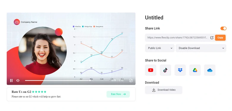
Share Data Visualization Video
FAQs About Data Visualization Video
1. Why should I create a data visualization video?
Data visualization videos simplify complex data, engage views more effectively than static reports. What’s more, data visualization videos make it easier to highlight trends, and key insights.
2. What types of data can be visualized in a video?
You can literally visualize any type of data, including sales trends, survey results, financial data, etc. As long as those data are delivering correct and insightful information.
3. How long should a data visualization video be?
Typically, data visualization should be concise, lasting between 1 to 2 minutes, depending on the complexity of the data.
4. How do I choose the right visual format for my data?
Choose the format that best communicates your data’s message. For example, you need to use the line chart to show trends over time. Bar charts are best for comparisons, pie charts for percentages. The clarity of the message is key.
5. Can I add music or voiceovers to my data visualization video?
Adding backgroud music or add voiceover can enhance your data visualization video. Music sets tone, while voiceover can give audiences a clear picture of the data. FlexClip allows you to easily add background music and generate AI voiceover.


FlexClip Video Maker
The easiest way to help you create custom videos, no design skills needed.
Start Now for Free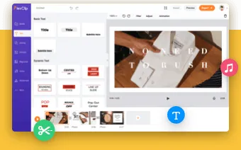
Hot & Trending
-

Ultimate Tik Tok Guide – How to Tik Tok & How to Make a Tik Tok Video that Gets Likes
-
Instagram Story Video Quality Bad After Upload? Fix It!
-

7 Best Ways to Find Music in YouTube Videos
-

How to Repost Video on TikTok & How to Remove TikTok Repost
-

Improve Video Quality Online: 3 AI Video Quality Enhancers You Can't Miss
-

4K Convert to HD 1080p without Watermark: Best 4k Video Converters
-

How to Change Face in Video on Phone/Desktop/Online
-

Top 13 Birthday Video Makers with Music and Effects Free